The UCSD App


[ Before ]
COMM124A
UCSD App Redesign
From first hand accounts and testimonials from countless peers, our team sought to address the disconnected social life at UCSD, known lovingly by the online moniker: "UC Socially Dead".
The app as we know it suffers from fragmented navigation, underused features, and the lack of centralized information.
Through user research and iterative prototyping, we reimagined the app as a streamlined student resource and a tool to facilitate gathering in-person, as much as possible— through personalized event calendars, location sharing, and a social network known as "The Forum".
The Big Problem:
Cultivating Community
Motivated by the lack of community on campus, we hoped to create a space where students can feel connected to campus by finding communities they can be apart of.
Research
We conducted online surveys and reviewed responses from students to gain insight about The Big Problem at UCSD.

[ 88.1% of students surveyed describe the UCSD community as "Weak" or "Very weak" ]

[ Students heavily rely on digital means to connect to the campus ]


Key Insights
The lack of community is due to:
1. Students not knowing what is available to them
2. Feeling unable to reach out to others despite wanting to connect
3. The lack of centralized spaces and common identity
The Solution:
Redesign the UCSD App
Original
(Jan 2025)


✏️ Design Audit
1. Underused functions are featured prominently
-
Wifi speed, covid kit, weather
2. Maps page is poorly labeled and not catered to campus life
-
parking lots are labeled by number and not name ("P608" instead of "Gilman Parking lot")
3. Events are hard to navigate and personalize
-
Viewing an event will take you to it's browser webpage
-
No way to connect with others going to the event
4. Lack of community features
-
The user experience is very individual and does not allow any interaction between users.
Backed by research...
Audit Research

[ 70.6% of students surveyed rarely or "Never" use the app ]
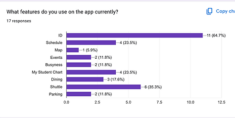
[ The most used function is the 'Student ID' ]

[ App lacks functionality and community centralization. ]

[ Students want a better user interface and more specific functions]
Wireframing
Lofi Sketching


4.
3.
1.
2.
Core Pages
Incorporates:
Home emphasizes the user's profile and student ID. Additional links are easy to skim as big buttons.
1.
2.
Horizontal overlay navigation tab.
3.
Relabeled and consistently updated map.
4.
Calendar allows users to organize events and personalize their schedule.

1.
2.
3.
4.
Digital Community - 'The Forum'
A completely new portion of the existing app,
The Forum represents a school-wide digital community.
Incorporates:
Home page with updating posts from followed clubs/organizations.
1.
2.
Horizontal overlay navigation tab.
3.
Personal notifications from user to user.
4.
Organization profile pages with posts and comments.
*note there are no personal profile pages
Mid/ High Fidelity

Architecture

Core Pages
Utilized a style guide to flush out the designs according to the architecture we laid out in the lofi sketches.
Home -
The most used features, the student ID and schedule, are easily accessible.
Map -
The map is relabeled as a UCSD landscape.
Calendar -
Provides clear event timelines and participation personalization.
Notification -
Relatively unchanged vertical format as the original.


Used interactive prototyping to make dynamic and engaging aesthetics.

Digital Community - 'The Forum'
We refined our vision for 'The Forum', emphasizing the importance of the location, planning, and bulletin features to facilitate event planning.
Home -
Emphasizes an updating feed of followed orgs and event postings.
Community -
Function as a hub for specific clubs and communities.
DM Notifs -
Users can message one another directly on the app, location sharing feature is easily accessible.
DM Layout -
Relatively standard messaging platform with calendar-sharing capabilities.
Final Deliverable

[ We gave a final stakeholder presentation to showcase our solution at the end of the 10 week period ]
Reflection
With the goal of context-specific restructuring and improved usability, my team rebuilt the UCSD app with clear layouts and refined functions. I learned to gather feedback about the struggles of users and how they would realistically use the app to improve their experience at UCSD and bridge gaps within the community.
We confronted what features students need, want, and have the potential to benefit from, using our foundations in design to visualize that capability.
Original


Design Audit
-
Underused features are front page
-
Maps are unlabeled and ineffective
-
Events are hard to navigate and unpersonalized
-
Lack of community features
Redesign


Key Features
-
Unified dashboard with personalized content
-
(class schedules, grades, calendar)
-
-
Interactive campus-relevant map
-
Campus events feed with RSVP system
-
In-app community, 'The Forum' with messaging and discussion threads