Yuanpei University of Medical Technology
June - Sep 2024
(4 months)
UI/UX Design Intern
Taiwan | Remote
Designed a new website for a pilot summer exchange program aimed at recruiting US high school students. Spearheaded research and prototyping, organized regular meetings with stakeholders to define goals and validate progress.
Timeline


Research
Competitive Analysis of similar exchange abroad programs and application form platforms.
- UCEAP
- CIS Abroad
- Google Form
- CIEE
- USAC
- Turbotax
[Overview on Figma]
Identifying our Users

[User Personas]
Design

I devised a style guide based on the school colors with a range from light to dark utilizing a dusty blue as the accent color.
Low Fidelity : two options
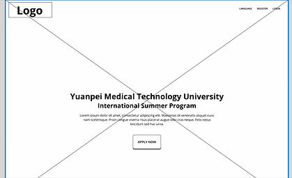
Home Page
1. Horizontal Nav

2. Vertical Nav

1. Horizontal
A horizontal navigation bar that tracks the user as they scroll down the screen. I felt the position at the top of the page de-emphasized the importance of the sections.
2. Vertical
A vertical navigation bar that is constantly present at the side as the user scrolls down. I felt that the sequence of the buttons aligning with the order of their position on the page made for an intuitive layout.
Application Page
1. Horizontal Nav

2. Vertical Nav

1. Horizontal
A horizontal progress indicator at the top uses color to give users visual feedback about the progress of their application, emphasizing the order of each page.
2. Vertical
A vertical progress bar at the left uses icons to show the user's progression in their application. The order of each page in the process is less emphasized.
Ultimately, I went with 2. Vertical navigation bar and layout as I liked the easy navigation within the information-heavy page, as well as the intuitive layout. I continued to keep the vertical framework for all steps of the process from landing page to application for cognitive consistency.
I proposed this in our next stakeholder meeting and the design decision was approved.
Mid Fidelity
Information architecture and defining the scope.
I started to gather the insights about what information the user would need to "buy in" and apply to the program from start to finish.

'why' and 'how'


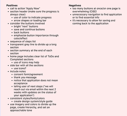
Validate
After rounds of adjustments and content revisions, we inputted realistic information and formatted the polished sections.
Keypoints
3. Information heavy sections were very important to give users all the information they would need to entice them to sign up. In order to navigate this obstacle and create more balance, we would emphasize replacing the placeholder adobe stock images with personalized images from Yuanpei's summer exchange program with it's partner schools in Japan.
2. Cultural nuance was another important factor to consider as this was Yuanpei's pilot attempt to attract the American demographic as opposed to their exchange programs in past years with students from Japan.
To address this, we tried to emphasize exploration and cultural experiences to discover the country beyond the classroom, catering to a more curious and independent spirit.
1. The Hero Section encountered a limitation when the development team revealed that the application button could not be placed on top of a carousel image.
Therefore, we worked around this by placing the call to action button in the header.
High Fidelity
Home Page


Application Page

Handoff
After finalizing the design and content we came together with the development team for a final review and to
give us the green light that implementation was possible. As I was reaching the end of my internship, I left the rest of the project to the stakeholder and development team.
I not only worked on the UI/UX design front with this experience, I also learned about the higher level aspects of a design project like team management and timeline tracking to ensure the whole project moves forward despite multiple moving parts.
Start
Finish